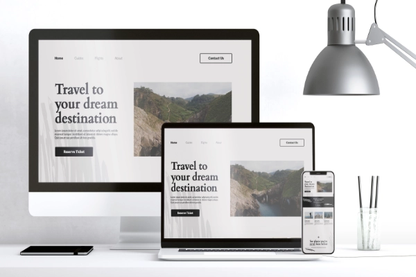
In today’s digital world, websites must adapt to a range of devices—from desktop monitors to smartphones. Responsive design is the practice of creating a website that provides an optimal user experience regardless of screen size or device. This guide will walk you through the fundamentals of responsive design, helping you create websites that look and function beautifully on any platform.
1. What is Responsive Design?
Responsive design ensures your website adjusts seamlessly to different screen sizes and orientations. Instead of building separate versions of your site for each device, responsive design uses flexible layouts, scalable images, and CSS media queries to deliver a consistent experience.
2. Why Responsive Design Matters
- Mobile Usage Dominance: More than half of global web traffic comes from mobile devices. A responsive site is crucial to engage these users.
- Improved SEO: Search engines like Google prioritize mobile-friendly sites in search results.
- Enhanced User Experience (UX): Responsive websites reduce frustration by ensuring navigation and content are accessible on any device.
- Cost Efficiency: A single responsive design replaces the need for multiple versions of your website.
3. Core Principles of Responsive Design
- Fluid Grid Layouts:
Responsive websites use relative units like percentages rather than fixed units like pixels to define layout dimensions. This ensures elements scale proportionally on different screen sizes.Example:css.container {
width: 80%; /* Relative width ensures adaptability */
margin: auto;
}
- Flexible Images and Media:
Images should resize to fit their containing element without breaking the layout. Use CSS properties likemax-widthto achieve this.Example:cssimg {
max-width: 100%; /* Prevents images from overflowing */
height: auto;
}
- CSS Media Queries:
Media queries apply different styles based on the device’s characteristics, such as width, height, or orientation.Example:css@media (max-width: 768px) {
.menu {
display: none; /* Hide the menu on smaller screens */
}
}
4. Tools and Frameworks for Responsive Design
- CSS Frameworks:
Frameworks like Bootstrap and Tailwind CSS provide pre-designed responsive components, making it easier to create adaptable layouts.- Bootstrap Example:
html
<div class="col-md-6 col-sm-12">Responsive Content</div>
- Bootstrap Example:
- Online Testing Tools:
Use tools like Responsive Design Checker or Google Chrome’s DevTools to preview your site on different screen sizes. - Responsive Images:
Use thesrcsetattribute in HTML to serve appropriately sized images based on the user’s device.
Example:html<img src="small.jpg" srcset="large.jpg 1024w, medium.jpg 768w" sizes="(max-width: 768px) 100vw, 50vw" alt="Responsive image">
5. Responsive Design Best Practices
- Mobile-First Approach:
Start designing for smaller screens first, then add features for larger devices. This ensures a streamlined and user-friendly experience. - Test on Real Devices:
Simulators are helpful, but testing on actual devices ensures a true-to-life user experience. - Prioritize Content:
Consider what content is most important for users on smaller screens. Simplify navigation and focus on key features. - Use Responsive Typography:
Font sizes should adapt to the screen size for readability. CSS properties likeclamp()allow for scalable text.
Example:cssh1 {
font-size: clamp(1.5rem, 2vw, 3rem);
}
6. Common Challenges and How to Solve Them
- Breakpoints Selection:
Breakpoints are the screen sizes where your design adapts. Common breakpoints include 320px (mobile), 768px (tablet), and 1024px (desktop). Test different devices to find optimal values. - Complex Navigation:
Simplify navigation with a hamburger menu for small screens.
Example:html<button class="menu-toggle">☰</button>
- Performance Optimization:
Ensure your site loads quickly by:- Compressing images using tools like TinyPNG.
- Minimizing CSS and JavaScript files.
- Using a Content Delivery Network (CDN) for faster asset delivery.
7. Examples of Great Responsive Websites
- Apple: Their site adjusts beautifully with a clean design and intuitive navigation.
- Airbnb: Uses responsive images and a mobile-first approach to prioritize key features.
- Smashing Magazine: Combines flexible grids and media queries for a seamless experience.
Conclusion
Responsive design isn’t just a trend—it’s a necessity in today’s digital landscape. By adopting the principles and practices outlined here, you can create websites that are not only visually appealing but also user-friendly on any device.
Start with a mobile-first mindset, test relentlessly, and let your creativity shine. Ready to transform your website into a responsive masterpiece?


") GB
GB  HU
HU